
UI/UX Redesign
Product design
A redesigned operational UI so staff could finish the job on one screen instead of three tools.
Task Time
Training Hours
Error Rate
Delivery Context And Business Outcome
Industry
Duration
Technology Stack
Key Outcome
Client Industry, Timeline, Team, Stack, And Result
Client Industry
Internal product
Project Timeline
7 weeks
Team Size
6 specialists
Tech Stack
Design system, React, accessibility
Headline Result
Primary tasks completable without a tribal-knowledge tour
Problem Statement, Baseline, And Success Criteria
Clear pre-project constraints and measurable targets establish how outcomes are evaluated.
Problem Statement
Users hopped between tabs to finish one ticket.
Goals And Success Criteria
Where Performance Started Before Delivery
Task Time (Before)
Training Hours (Before)
Error Rate (Before)
What The Engagement Needed To Deliver
Infinoid redesigned the highest-volume screens around the real job-to-be-done, then implemented the system so engineering could reuse it.
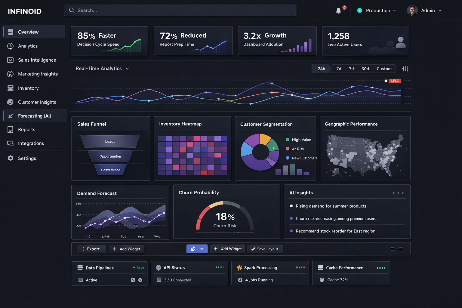
UI redesign of an operations console
Discovery To Optimization With Duration
Discovery
1-2 weeksStakeholder interviews, baseline audit, and scope alignment.
Design
1-2 weeksUX flows, technical architecture, and sprint planning.
Build
4-8 weeksIncremental feature delivery, integrations, and instrumentation.
QA
1-2 weeksFunctional testing, performance validation, and accessibility checks.
Launch
3-5 daysControlled release, production validation, and monitoring.
Optimization
2-4 weeksPost-launch iteration based on telemetry and user feedback.
How The Product Direction Was Resolved
Screen Sprawl
Users hopped between tabs to finish one ticket.
Inconsistent Patterns
Every form behaved differently.
No Accessibility Pass
Keyboard and contrast failed basic checks.
Mapped the top tasks and collapsed them onto fewer screens.
Shipped a small design system for forms, tables, and status.
Checked contrast and focus order on the paths staff use daily.
Why This Approach Was Chosen
Mapped The Top Tasks And Collapsed Them Onto Fewer Screens.
Tradeoff: Screen sprawl
Rationale: Selected for long-term scalability, maintainability, and stronger business outcomes.
Shipped A Small Design System For Forms, Tables, And Status.
Tradeoff: Inconsistent patterns
Rationale: Selected for long-term scalability, maintainability, and stronger business outcomes.
Checked Contrast And Focus Order On The Paths Staff Use Daily.
Tradeoff: No accessibility pass
Rationale: Selected for long-term scalability, maintainability, and stronger business outcomes.
Before And After Comparison With Hard Numbers
| Metric | Before | After | Delta |
|---|---|---|---|
| Task Time | 100 index | 65 index | -35% |
| Training Hours | 100 index | 60 index | -40% |
| Error Rate | 100 index | 75 index | -25% |
Technical Outcomes After Launch
Lighthouse Performance
Core Web Vitals
Accessibility Score
Continuous Improvement Opportunities
Expand A/B testing coverage for high-traffic user journeys.
Add deeper event-level analytics for conversion funnels.
Extend automation around regression and accessibility audits.
Next step
Need The Product To Match How People Actually Work?
Show us the screens that hurt. We will propose a redesign slice with implementation.
What we cover
- 01
Named delivery from the Noida desk
- 02
Integrations against systems you already run
- 03
Hire dedicated engineers if you need people on your cadence
Typical first call · 30–45 min